🚀 Top 10 Common CSS Mistakes: A Developer's guide 🎨
Are you making these CSS blunders? Let's dive📝 into the top 20 mistakes in CSS with examples to help you level ⬆️.

Hey there! I'm Hemanth Vishwakarma, a passionate software developer with a keen interest for learning. 💻
📚 I believe in the power of knowledge sharing and community collaboration. That's why I'm here on Hashnode.
🌐 As a full-stack developer, I'm proficient in languages such as java, frameworks like spring, and databases including pslql. I'm passionate about building user-friendly interfaces with modern front-end technologies.
✍️ Here on my Hashnode blog, you'll find insightful posts covering topics related to my learnings, as well as tutorials and tips to help fellow developers level up their skills.
Certainly! Let's go through some common CSS mistakes with examples:
Incorrect Selectors:
When you use multiple selectors for your element you must choose the right one to style your element accordingly.
For example, say you have multiple buttons on your pages and these buttons might share common borders, so it would be advisable to use class for them, however, if you want a certain button, say a "BUY NOW" button you might want to style it differently. For this, you can use an "id" selector as well. This will ensure that you have the required border styling as well as the necessary changes
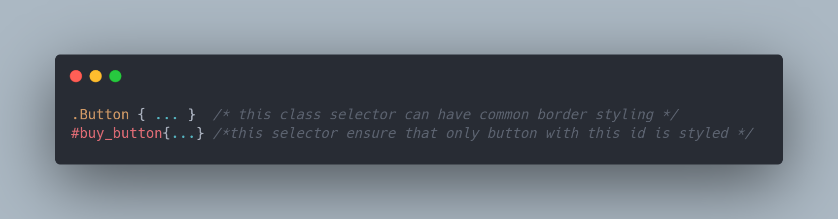
You must know CSS specificity rules. Also, ensure that your selectors match accordingly.
Typos:
Typos can cause rendering issues in your browser and property might now show up for the element. These are very difficult to identify as they are manual errors.
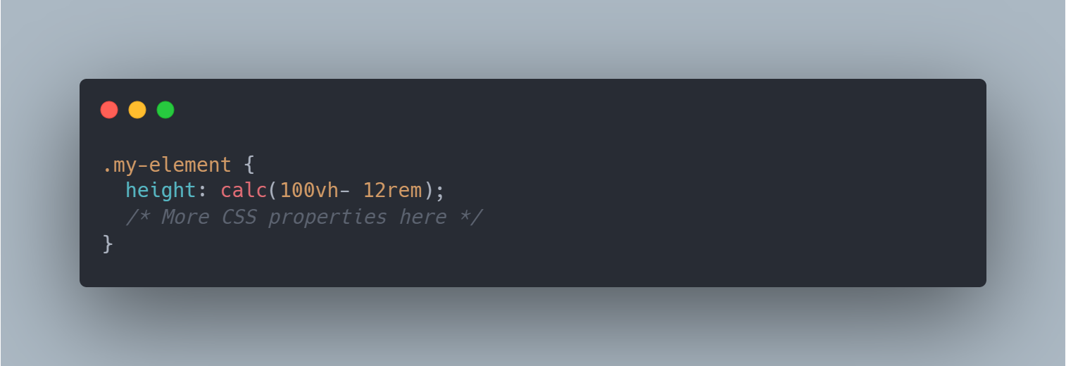
For example, can you spot why is this expression:- calc(100vh- 12rem) invalid?
I couldn't and it took me an hour to figure out what was wrong. I tried inspecting my browser console but was no use. Finally, after some manual tries here and there I was able to resolve this issue.
In CSS, use calc() function is used to perform basic mathematical calculations on property values. However, there are certain rules and limitations to its usage.
The reason why
calc(100vh - 12rem)might be considered invalid due to the space between the value and the operator. CSS requires spaces around the+,-,*, and/operators inside thecalc()function. Without the required spaces, the browser will not be able to parse the expression correctly, resulting in an invalid value.Here's the correct example:

Can you notice space after 100vh? a small space can make a difference.
In this example, the height of the
.my-elementwill be set to the height of the viewport (100vh) minus 12 rems.Overusing ! important:
In this example, we have two styles, one with the class
cardand another with the classcard-sale. The!importantdeclarations are used excessively in thecard-saleclass, which is intended to illustrate the issues that can arise: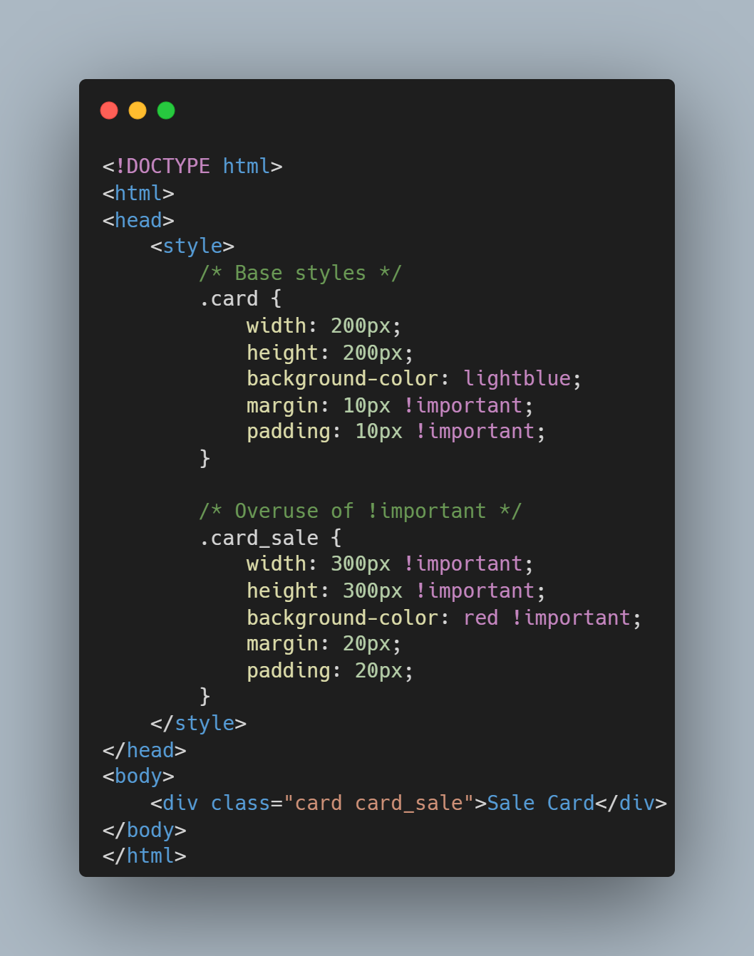
The
card-saleclass uses!importantas well as thecard. This makes it difficult to override certain properties.Suppose you wanted to apply extra padding and extra margin to your sale card, however, this becomes difficult to override as the .card CSS already has a declaration for width and height marked as important. Similarly, when we have multiple elements in our html we must avoid the usage of !important as this can lead to unnecessary conflicts and confusion.
More importantly, it is suggested to use to override specific styles in exceptional cases.
Not Using a Reset or Normalize:
This lack of consistency can be frustrating for web developers and makes it challenging to create a consistent user experience across different browsers. To address this issue, developers often use CSS resets or normalize.css to remove or standardize default styles across browsers, providing a consistent starting point for styling web pages.
Not Using External Stylesheets:
Consider this-
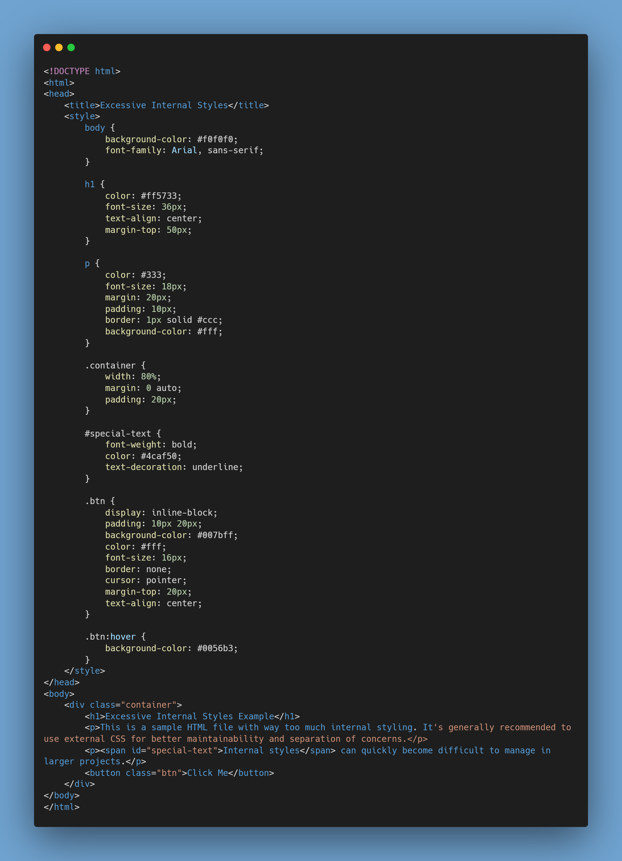
And this:-
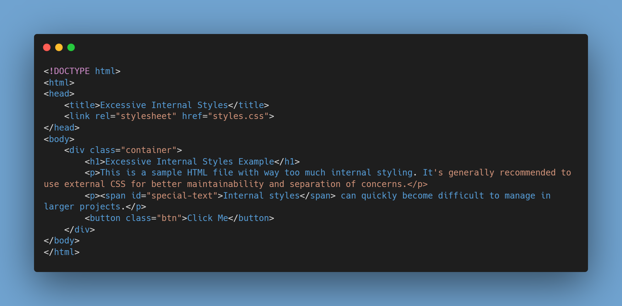
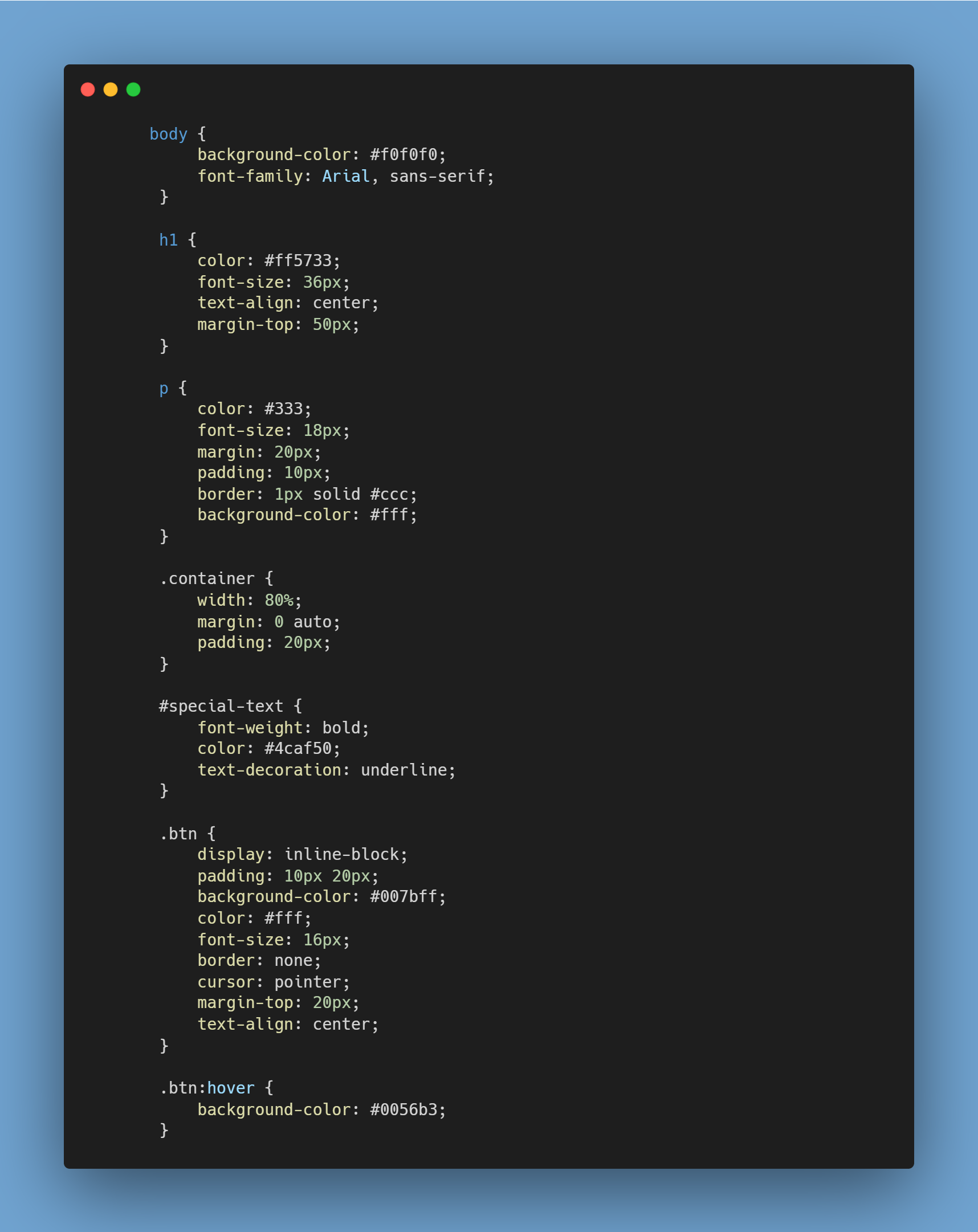
From the above two definitely, the second one is simple and visually appealing.
Inline styles can make our HTML code cluttered and harder to maintain. It becomes difficult to maintain especially in larger projects. Using inline styling can limit our ability to apply the same style to other elements that may require it.
Also using the styles on HTML documents can affect performance whereas external CSS files are cached by the browser thereby leading to fast load times. Since the code looks cluttered it generally limits the developer's ability to focus on the HTML and debug it while the usage of external css modularises the code as well. On the other hand, using external CSS makes our code more visually appealing and in terms of presentation.
In summary, while there may be specific cases where inline styles are convenient (such as quick prototyping or small one-off projects), the use of external stylesheets is generally recommended for larger, more complex web development projects due to their advantages in terms of maintainability, reusability, and overall code organization.
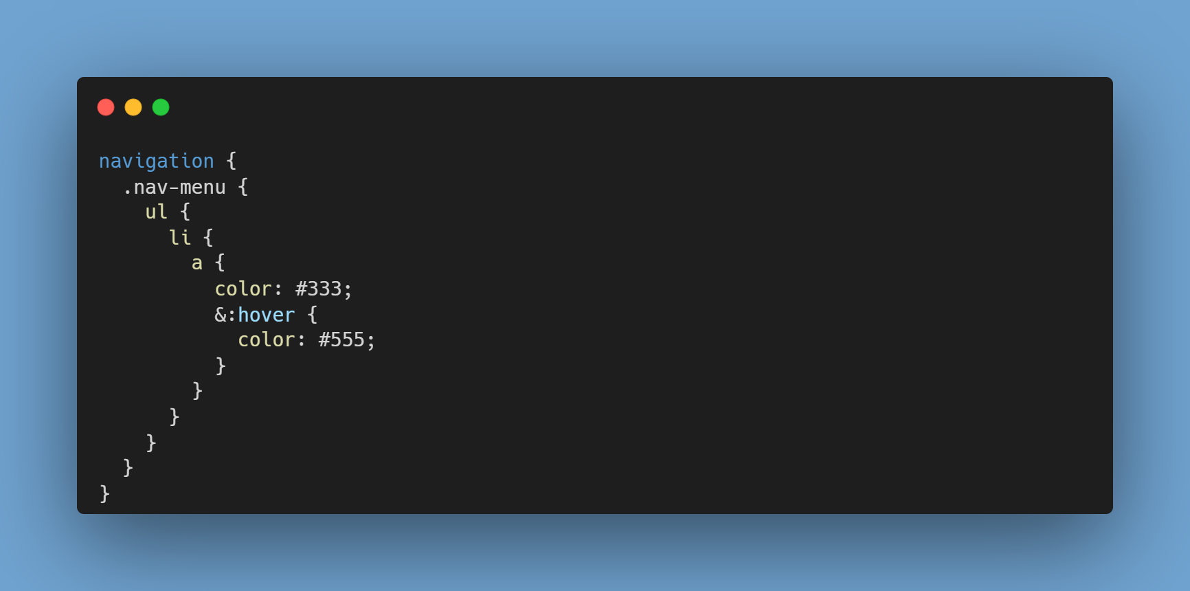
Nesting Too Deeply:
Nesting too deeply in CSS can make our stylesheets complex and harder to maintain.
Specificity Wars: When we nest elements deeply we may go in conflict with certain other elements and their stylings.
Increased File Size: It can also increase the size of your stylesheet. Larger files take longer to load, as browsers must traverse nested selectors to apply styles to elements. This can slow down your application's performance when you have a complex application with multiple UI elements.
Readability and Maintainability: Deeply nested code is difficult to understand and more error-prone and can lead to unpredictable styling un your UI.
Here's an example of deeply nested CSS:
To avoid nesting issues, follow these best practices for managing nesting in CSS:
Limit Nesting: Only nest when it logically makes sense, such as for pseudo-selectors or states like
:hover.Use Classes and IDs: Instead of using multiple selectors, we can target the styling of elements using class and ID attributes. Also, try to minimise the use of descendant selectors.
Modularize Your Styles: Break your styles into smaller, modular components that are easier to manage. Utilize mixins and variables to reduce nesting. This allows us to write cleaner and more maintainable code.
By following these best practices, we can write CSS that is more maintainable, and visually appealing.
Not Using Comments:
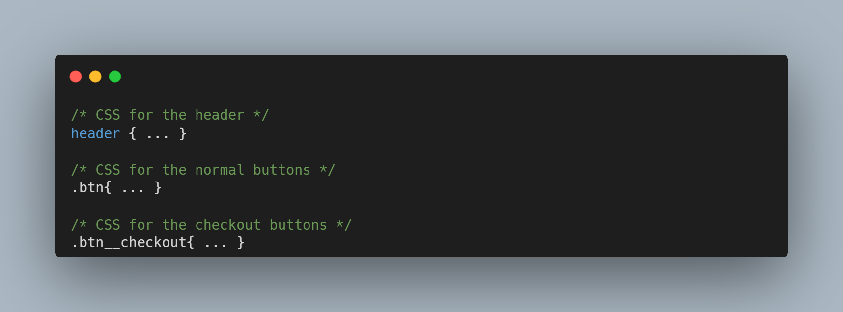
Use comments to describe the purpose of your CSS rules. Comments can also be used to comment out some parts of code as well.
Comments are important for development and maintenance, we should not use sensitive information or excessive comments in production CSS files, as they can increase file size or potentially reveal unnecessary details to end-users.
Not Using Flexbox or Grid:
Instead of using properties like float and then having to worry about the margins and spaces around an element. It is advisable to use a flexbox or grids. They are designed in such a manner that an element can automatically be adjusted inside a container without the developer having to worry about the margin and width properties. Flexbox provides more control over alignment and spacing and is generally easier to work with for many layout tasks.
We can also use Flexbox or Grid for centring and positioning elements when applicable.
Ignoring Responsive Design:
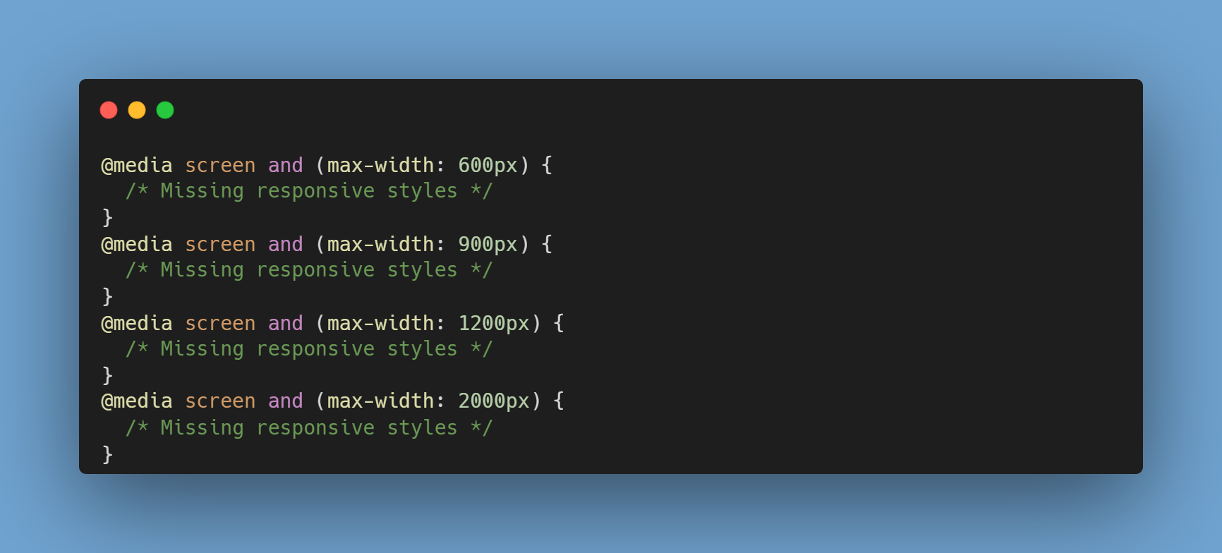
A responsive website adapts its layout and content to different screen sizes and devices.
The use of mobile devices to access the internet has surged in recent years. Failing to provide a mobile-friendly experience can result in higher bounce rates and loss of potential customers.
Suppose with the ever-changing landscape of device usage, mobiles become more popular and if your application is limited to desktops it can damage the reputation of a company. So adding appropriate breakpoints and media queries in CSS for your styles can significantly reduce the impact instead of having to develop an entirely different UI for the same. This also shows how much is the application owner dedicated towards his project.
Responsive design is an important aspect of modern web development that addresses the diverse ways people access the internet.
Not Testing in Different Browsers. Ignoring Performance:

Testing cross-browser performance in CSS involves ensuring that your styles work consistently and efficiently across different web browsers.
Identify Target Browsers: Determine which browsers and browser versions you need to support based on your target audience and project requirements. Commonly supported browsers include Google Chrome, Mozilla Firefox, Microsoft Edge, Safari, and Internet Explorer (if necessary).
Test Responsiveness: Ensure that your CSS styles are responsive and adapt well to different screen sizes and resolutions. Use the developer tools to simulate various screen sizes and check for layout issues.
Test CSS Features and Properties: Verify that CSS features and properties are consistent across browsers.
Check for Browser-Specific Issues: Be aware of browser-specific issues and limitations. Check for compatibility from websites like Can I use to see specific features.
Fallbacks and Polyfills: Implement fallbacks or polyfills for CSS features that aren't supported in older browsers.Ex:- map function may not work for IE version 8 or below and hence you might have to use polyfill.
By avoiding these common mistakes and following best practices, we can write cleaner and more maintainable CSS code.


